-
The pictures and text boxes are on the blog page are HUGE, making the pictures distorted and making the scrolling very challenging. Can we have them arranged more like the podcast page please?
Hello!
I’m not sure if I understand the problem.
Could you please share your website url with us?
Thanks,Andrea
The podcast page https://shockyourpotential.com/podcast-archive/
The blog page https://shockyourpotential.com/blog/I would wish the blog page to appear like the podcast page.
Hello!
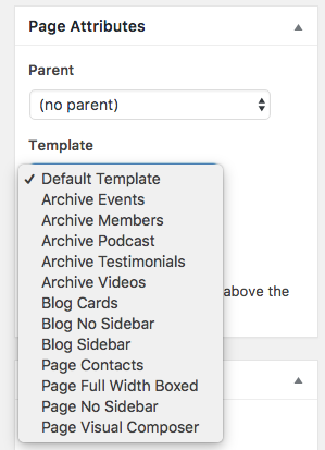
In order to get your blog posts listed as podcasts you should edit the source code of the theme.Said this, you can get something similar by switching the blog archive page template: go to your backend, then pages and edit your blog archive page. Now on the right sidebar switch the page template to Blog cards.
Save and you should be ready to go.
You can check a demo of this template on our theme demo here: http://themes2go.xyz/demos/lifecoach/blog-cards/Hope this helps,
AndreaHello,
This is what I have done but the results are not desirable: Gone to the backend of the blog page where all the posts appear https://prnt.sc/1236uya
Then to this page https://prnt.sc/1236znq
Is this where I should be making the change or on the individual posts on the page?
Hello!
The page is the right one but I can’t see if you switched the page template properly.As I can see you’ve parented the blog page with podcasts.
You need to edit the proper “Page Attributes” tab

You can also try creating a new page and select the blog cards template, save, and check it again.
-
This reply was modified 3 years, 7 months ago by
themes2go.
-
This reply was modified 3 years, 7 months ago by
The topic ‘Changes to the Blog Page’ is closed to new replies.
